The secret to B2B landing page construction involves a detailed understanding of your incoming leads, your marketing process, as well as how users interact with elements on your page. Before we get too far into the discussion, keep in mind that once you build a landing page, you should test it. Once you have tested it with real users, on your domain name, and have made all the changes you need to make to capture the most leads, you can use that version for your other landing pages by changing the placement and offer to match where the user is in the conversion process. If your offer or lead gen form changes dramatically, you will want to update it, and test again, to make sure your updates didn’t negatively impact your users.
Good B2B Landing Page Construction Will Increase the Number & Quality of Your Leads
Many B2B marketers jump right into building their landing pages without taking time to do their homework. Landing pages made that way tend to have lower conversion rates.
Know Your Lead
Having a clear understanding of the goals and motivations of your buyer personas is the place to start. Hubspot says, “A buyer persona is a semi-fictional representation of your ideal customer based on market research and real data about your existing customers. When creating your buyer persona(s), consider including customer demographics, behavior patterns, motivations, and goals.” Many a marketing hour has been wasted when organizations use the shot gun approach and spread a wide net, rather than a specific one. Not only that, making offers and nurturing leads that are not your prime market will distract you from your goals. You can get the data you need to create your buyer personas from carefully crafted surveys, polls, and user analytic data. If you are completely new to this idea, Buffer offers an excellent resource: Marketing Personas: The Complete Beginners Guide.
Lead Your Lead
Buying Process
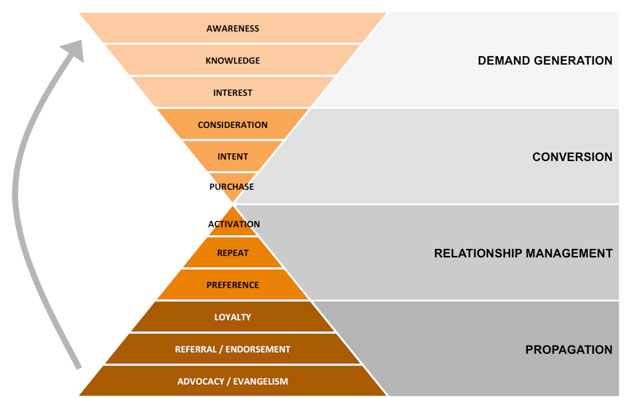
In 1968, Engel, Blackwell and Kollat developed a model of the consumer buying decision process, which looks very much like a funnel:
- Problem/Need Recognition
- Information Search
- Evaluation of Alternatives to Meet this Need
- Purchase Decision Intent
- Purchase
- Post-purchase Behaviors
The content for your landing pages needs to be properly aligned with the buying process. As your leads are going through the guided tour of your website, your content should match the stage they are in. And, your website should funnel them through the stages, towards conversion. For example, if your prospect is doing research in the demand generation stage, you’ll want to offer information to help with that. If they are in later stages, you might want to offer a product demo or a free estimate.
The Offer
An offer is anything you give your visitors in exchange for getting them to do what you want. This could be monetary offers like coupons or discounts, but it also can be a free trial, a free version of the product, a whitepaper, etc. The offer needs to be sufficiently helpful, relevant and valuable so that your prospect will be willing to share their contact information in return for it, and it needs to pull your user deeper into the conversion funnel. Whatever you offer, be sure to create a sense of urgency, as in, a deadline.
Call-to-Action (CTA)
CTA’s are what bring a visitor to your landing page. In marketing, a call to action is an instruction to the audience that provokes an immediate response, usually using an imperative verb such as “call now”, “find out more” or “visit today”. It is an essential part of inbound marketing, in that it actively strives to convert a user into a lead, and later into a customer. Plan them carefully, be succinct, and entice them to click on it or they won’t discover your landing page at all.
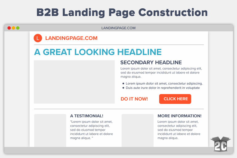
B2B Landing Page Design
Be Visually Concise
Since your landing page should be funneling your users towards becoming leads, your design needs to capture your lead in a corral. Once in the corral, you don’t want a bunch of escape routes. You want the only path to lead towards taking the approved action. This means that busy landing pages with a million links on them, are practically no corral at all.
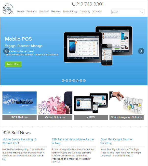
For example: B2B Soft has no clear goal on this page. I have so many choices, I will probably miss the one I really want to make. From the rotating banner, so the splattering of links and images, I am visually distracted. I will leave the site now.
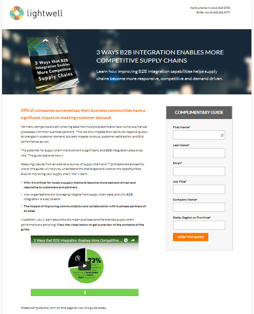
On the other hand, Lightwell has a concise, easy-to-use landing page, with little navigation, and all of the information you need to convince you to go to the next step.
The Three C’s of Headlines
Sell From Your Customer’s Viewpoint
- List the core features, benefits and pain points of your customer in bullet points.
- Make sure the list doesn’t distract from the CTA.
- Locate fuller descriptions below the fold, away from the CTA, if necessary.
- Use icons to make your list more visually appealing and friendly.
- Sometimes a video is the right move. Test, test, test.
Try different approaches to see what works best with your audience. It’s important to test which each point you highlight, how many you show, and how you describe them. It is best to test one change at a time, so you know what worked or didn’t work.
Use Images that are Relevant
For B2B websites, offers often come in the form of whitepapers, webinars, eBooks. Turn the cover of your digital offering and use a tool like Adazing to turn it into a book cover, or use a photo of the presenter.
Social Proof
Also known as informational social influence, is a psychological phenomenon where people assume the actions of others in an attempt to reflect correct behavior for a given situation.
- Testimonials are even more believable when you use the author’s photo.
- Numbers (of people who downloaded it already, etc)
Form Fields
Don’t be caught up in form folly, by using too many form fields, which can cause people to bounce off your page. Use the least number of fields that will gather the amount of information needed. How do you know if your forms are too long? How do you know what fields are the ones that need to go? Just guessing? Stop it. Heatmaps and Form Analytics can show you exactly what changes you need to make.
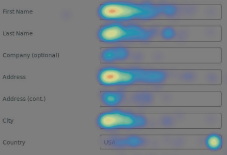
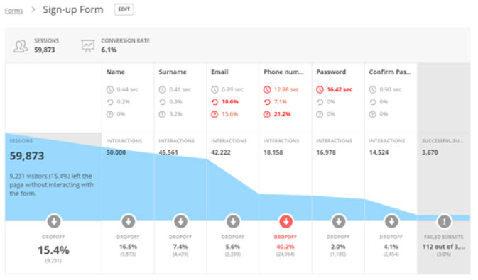
As always, test, test, test. Your goal is to have the most conversions, while getting the information you need.
Measure Your Success
Landing page success is typically measured by submission rates, which is the percentage of views that result in a form submission. The average form conversions rate is approximately 17% as of March 2015, according to Marketing Charts. Keep in mind that Contact Us pages, are not considered landing pages. Most users are looking for an address or phone number on these pages, and are not looking to fill out a form.
Relationship Management
Since only 1% of users fill out forms on Contact Us page, your landing pages just got a lot more important! Make sure your landing page form data is being pulled into your marketing software, so that you can take action on the information, beyond the initial automated download that happens once they fill out the form.
Once you understand who you are marketing to, how to market to them becomes much easier.
